

Hey guys 👋
🇯🇵 この記事は日本語でも読めます → 日本語版はこちら
Happy New Year! It’s the year of the Snake 🐍, so here’s to a year of luck and success chasing us all.
It’s been a while since my last email — I took some time to wrap up a big chapter: leaving Poland after 5 years and fully embracing the digital nomad lifestyle.
My partner and I sold, donated, or threw away most of our belongings and packed our lives into just two suitcases. We kicked things off with two months in Bangkok, Thailand (where I’m writing this from), and next up: Fukuoka, Japan — just in time for sakura season.
If you run a business, live or freelance in these countries, I’d love to connect and learn about the challenges - please reach out.

With this big shift, I’ve been learning a lot about cultural differences in everyday life — and in design. Things got especially interesting when in January, thousands of Western “TikTok refugees” moved to the Chinese app RedNote (小红书).
That’s what led me to write this edition — a dive into how Western and Asian design cultures differ, and where we can find common ground.

🧨 What the TikTok Ban Taught Us About Design & Adaptability
Last month, the temporary TikTok ban in the US sent thousands of users scrambling for alternatives. Some landed on Instagram Reels, others on YouTube Shorts — but a surprising number ended up somewhere completely different: RedNote (follow me there 😉), China’s Instagram-TikTok hybrid.
At first, it seemed like just a temporary switch. RedNote’s interface is busier, denser, and packs in more information upfront — quite a contrast to Instagram’s clean, photo-based simplicity. By Western UX standards, it should have felt overwhelming.
But something surprising happened: Western users adapted.
Despite cultural differences in design (and poor translation), many users figured out how to navigate the app, engage with its content, and even appreciate some of its design choices. This challenges a common assumption — that Western users inherently need minimalism to function efficiently in digital spaces. Instead, it turns out they’re more adaptable than expected — and maybe the way we think about “good UX” is more flexible than we thought.

🌏 Western vs. Asian Product Design: Two Worlds, One Future
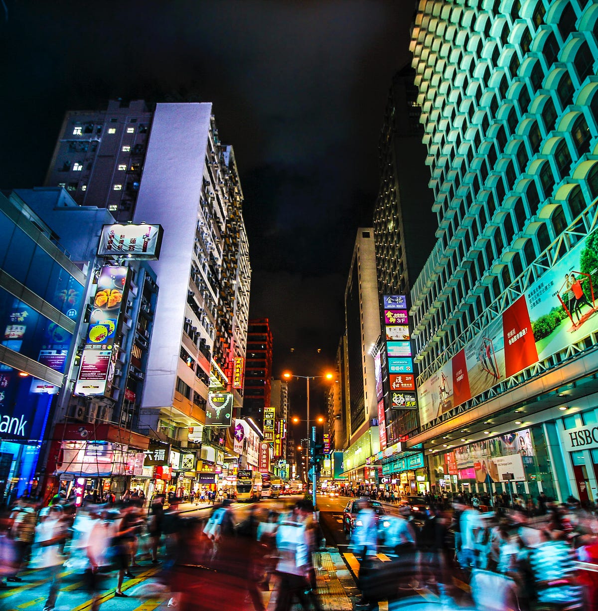
If you’ve ever landed on a Chinese, Japanese, or Korean website and thought, “Why does this feel so packed?”, you’re not alone. To Western designers, these layouts might seem cluttered, overwhelming, or outdated. But in many Asian markets, information density isn’t bad UX — it’s expected.

Why the Difference?
Western design (US, Europe) prioritizes minimalism, whitespace, clear hierarchy and progressive disclosure. It’s all about guiding users through a structured experience with fewer distractions.
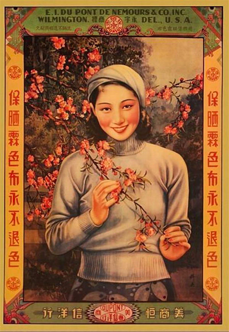
Asian or Eastern design (China, Japan, Korea) embraces more upfront information, denser layouts, vibrant colors, and multifunctional interfaces. Users expect to scan a lot of details at once rather than clicking through multiple pages.
Neither approach is inherently better, but RedNote’s example proves that people can adapt to both.

Key Differences in UI & UX
📜 Text & Language Density: Chinese, Japanese, and Korean languages don’t use spaces between words, making text naturally more compact. Plus, a single Chinese character can carry more meaning than an English word, so interfaces often look busier even when they aren’t.
🔠 Typography & Hierarchy: Western design relies on font size, whitespace, and structured grids for clarity. Asian platforms often use color, contrast, and boxed sections instead of relying solely on typography.
⬜ Whitespace vs. Content First: Western design treats whitespace as a visual break to improve readability. In many Asian interfaces, maximizing screen space is a priority, ensuring users get all relevant info upfront.
📱 Navigation & Information Architecture: Chinese super-apps like WeChat and Alipay pack multiple services into one platform (messaging, payments, shopping), while Western apps tend to specialize in a single function per product.

🧑🎓 What Can Designers Learn from Asian UX?
Instead of seeing Western vs. Asian UX as opposing forces, designers should look beyond their own design biases and explore how different approaches serve different needs.
Reconsider information density – Instead of defaulting to “less is more,” think about when providing more upfront might reduce user friction.
Challenge minimalism as a rule – Over-simplification can force extra steps, making navigation less efficient.
Trust users to adapt – RedNote proved that Western users can adjust to new UX patterns — so what other design conventions could be successfully localized?

🚀 Multicultural UX: The Future of Design
RedNote proved that users aren’t locked into one UX approach — they can adapt, learn, and engage with designs that break their norms.
RedNote is just one example — but it highlights a bigger shift in UX thinking: a future where digital experiences blend global influences rather than sticking to one rigid philosophy.
Western design brings clarity, hierarchy, accessibility and user-friendly simplicity.
Asian design brings efficiency, multifunctionality, and content density.
The future of UX is multicultural — combining the best of both.
As more products expand globally, we’ll see more hybrid design approaches that balance hierarchy with efficiency, simplicity with depth, and whitespace with information density.
The best design isn’t Western or Asian — it’s adaptable, inclusive, and shaped by the needs of diverse users worldwide.
Did you enjoy this topic?
P.s. During my research, I also found this brilliant post by @ux.verona where she explains how culture shapes design.

Instagram Post by @ux.verona
Read more about Multicultural UX


🌏 Working on something in Asia? Let’s connect!
If you’re working on a product in Asia that’s expanding internationally, or if you’re looking for a senior product designer who understands both Western and Eastern UX perspectives, let’s chat!
📩 Reply to this email or reach out here – always happy to connect and collaborate.


