

Hey guys! 👋
I’ve been getting lots of questions about the neobrutalism trend and its key features, so I figured… why not start sharing more helpful design resources and advice?
Let’s kick things off with fonts — specifically, my favorite picks for neobrutalist web design.
Table of Contents

Okay, what is Neobrutalism?
Just in case you missed it… Neobrutalism is a design style (or trend, if you prefer) inspired by the original brutalism movement in architecture. It’s defined by bold typography, raw simple shapes, high contrast, bright colors, solid strong borders, and hard shadows (shadow blur? Hell, no!).
It’s functional, minimal, and loud in all the right ways. I use it on my website, in some client projects, and right here in this newsletter.

Why did Neobrutalism get so popular?
After years of clean, soft, and “safe” design trends, people were craving something with more edge. Neobrutalism is just what was needed — unpolished, playful, and refreshingly bold.
It also carries a hint of nostalgia, like a throwback to childhood drawings or early web aesthetics. Startups like beehiiv and Gumroad use it to break away from boring B2B vibes and signal something more casual, youthful, and not boring.

What makes a font “Neobrutalist”?
In neobrutalism, typography isn’t just a detail — it is a huge part of the style.
Most neobrutalist fonts are bold Neo Grotesques or Geometric Sans Serifs with quirky details and vintage energy. It’s a chance to get playful with type in a way that still feels structured.
👀 But where do you draw the line?
It’s easy to go overboard.

Screenshot from Envato Fonts
Just because something looks great on a poster doesn’t mean it’ll work on a website or a mobile app.
Why?
Because we still have to think about accessibility, contrast, readability, loading speed — and the fact that people actually need to read your site.
So skip the overly decorative or tightly condensed fonts. Instead, go for chunky headers, clean body fonts, simple color palettes, and lots of whitespace.
My favourite free Neobrutalist fonts (Google Fonts)
Google Fonts offers a massive library of free, web-friendly fonts — and they’re great for site speed, too. Here are my top picks for any neobrutalist project:

1. Sora
A Neo-Grotesque Sans Serif with subtle nods to low-res aesthetics and early screen typography, but without nostalgia. Everything was made to feel crisp, fresh and modern. “Sora” means “sky” in Japanese, and the font feels just as open.
Best for: Headlines & body text, product UI, clean tech branding.
Pair with: Inter, IBM Plex Sans, Manrope, Noto Sans.
Why I love it: Sleek enough for body text, bold enough for headers. I use it for my own blog — it just works.

2. Epilogue
A Geometric Sans Serif font with a killer “g” and 9 weights — upright and italic, all packed into a variable font. It supports a wide range of Latin-based languages, making it versatile across projects. It shines in bold headers and big typography moments. That said, I don’t find it super satisfying for body text — the rhythm feels a bit off in longer reads.
Best for: Hero headers, buttons, punchy statements.
Pair with: Work Sans, Space Grotesk, Nunito Sans.
Why I love it: That “g” and all the weight options — it gives you room to get loud.

3. Syne
This one’s bold in every sense. A Geometric Sans Serif font that gets wider as it gets heavier, forcing some fun (and sometimes radical) layout decisions. The quirky “g” and smooth ligatures give it an artsy feel — but in Regular weight, it’s more clean and rounded, even a bit Poppins-like.

Syne gets wider as it gets heavier
Best for: Experimental layouts, loud hero titles, portfolios.
Pair with: Poppins, Epilogue, Lato, Inter.
Why I love it: It’s definitely not shy — it pushes you to be bold, but still feels clean and readable in lighter weights.

A Neo Grotesque Sans Serif with mixed flavor — part French, part British, part modern remix. I love its playful ascenders & descenders — just look at the “g” and “f.” It brings personality to headlines and adds edge to bold, expressive brands.
Best for: Headlines, bold modern brands, Gen Z vibes, portfolios with personality.
Pair with: Inter, Roboto, Lato, Noto Sans.
Why I love it: It’s got that weird-but-elegant energy. Total main character font — especially the sexy “g” and “f.”

Plus Jakarta Sans is a Geometric Sans Serif font by Tokotype. Inspired by 1930s grotesques (Futura, Neuzeit Grotesk), but cleaner, sharper and made for the modern web. It’s super versatile: bolds, italics, and regular weights all hold up beautifully.
But what makes it really special are the stylistic sets. Turn them on, and the vibe shifts completely — from playful to serious, minimalist to techy. It’s basically four fonts in one.

Stylistic sets (Plus Jakarta Sans)
Best for: Everything — headings, body text, UI, branding.
Pair with: Just itself. It can handle a full system. Also makes a great body font for Epilogue or Syne.
Why I love it: Italics and bolds look equally strong. Like Poppins’ cooler sister — but with built-in mood switches.

Darker Grotesque is a contemporary sans serif by a Vietnamese designer, inspired by postmodern and brutalist typographic trends. It feels like a tighter, edgier cousin of Space Grotesk — with smaller “g” descenders and a techier, more structured vibe.
The 2023 upgrade made it variable and fixed earlier issues, making it a better pick for modern product and web design. It has a naturally spacious line height, which makes it great for body copy — but the base font size is small, so be ready to bump up your REM settings (20px+ is a good start).
Best for: Tech startups, SaaS products, readable body text, modern UIs.
Pair with: Inter, Space Grotesk, IBM Plex Sans.
Why I love it: I love that it’s more rounded — gives it a nice geometric touch. And the fact that you can go bigger with paragraph typography is a win for readability.

7. Archivo Black ✦ HOT 2026 ✦
For moments when you just feel loud. Archivo Black is the heaviest cut of Archivo, a Grotesque Sans Serif family by Héctor Gatti and Omnibus-Type team. It was made for headlines and highlights, and it has that late-19th-century American look. It's built for high-performance typography, works in print and online, and supports 200+ languages.
In 2021 the family became variable, with weight and width axes running from Thin to Black and Condensed to ExtraExpanded — so you've got a lot of range to play with. Black is the one I'd grab for headers though. The letterforms are squared and heavy, and they're too much for body text, so keep this one for titles.
Best for: Massive hero titles, single-word statements, posters, loud CTAs.
Pair with: Archivo (its own regular), Inter, Space Grotesk, Work Sans.
Why I love it: Set it in ALL CAPS. The squared letters sit tight together and turn into a solid block of type, which is exactly the chunky header look I want for neobrutalism. It's the loudest font on this list, and caps is where it's at its best.

8. Anton ✦ 90s IN 2026 ✦
Anton is a single heavy weight, designed by Vernon Adams (creator of Oswald). It's a reworking of a traditional advertising sans serif, with the letterforms digitised and reshaped to work as a webfont. It's tall, narrow, and condensed, and it gives off that 90s newspaper headline or retro ad poster feel. There's only one weight, so don't expect a system out of it — it does one thing, and it does it well.
Because it's so condensed, you can fit a lot more words into a bold title without it falling apart, which makes it handy when your headline is longer than a couple of words.
Best for: Punchy headlines, longer bold titles, poster-style type, retro and editorial layouts.
Pair with: Inter, Roboto, Work Sans, Lato.
Why I love it: Set it in ALL CAPS. It's narrow enough to carry a long title and still hit hard, and the condensed shapes give it that loud, old-school print energy I keep coming back to.

9. Climate Crisis ✦ IT MELTS ✦
This one's a font with a mission. Climate Crisis was designed by Daniel Coull and Eino Korkala for Helsingin Sanomat, the largest Nordic newspaper, to make climate change feel less abstract. It has a variable axis called "Year," and as you move it the characters appear to degrade, like each one is a glacier melting away.

Climate Crisis melts as it moves toward 2050
Here's the clever part: the weights are tied to real Arctic sea ice data. The heaviest weight represents the sea ice in 1979, when satellite measuring began, and the lightest is the IPCC's 2050 forecast, when only about 30% of that ice is expected to remain. Drag the axis from 1979 to 2050 and you watch the type literally melt. It's striking enough that it's now in the Cooper Hewitt Design Museum's permanent collection.
It's a limited-use font, and that's fine — that's not what it's for. Keep it to ALL CAPS, the 1979–2000 range, and 48px and up.
Best for: Big statement headers, climate and editorial storytelling, anything that needs to stop people scrolling.
Pair with: Inter, Google Sans Flex, IBM Plex Sans — keep the body neutral and let this one do the talking.
Why I love it: It's fun and completely unique, but it's also doing something. A typeface that carries a message in its actual shapes is rare, and dragging that axis to 2050 gets the point across faster than a paragraph could.

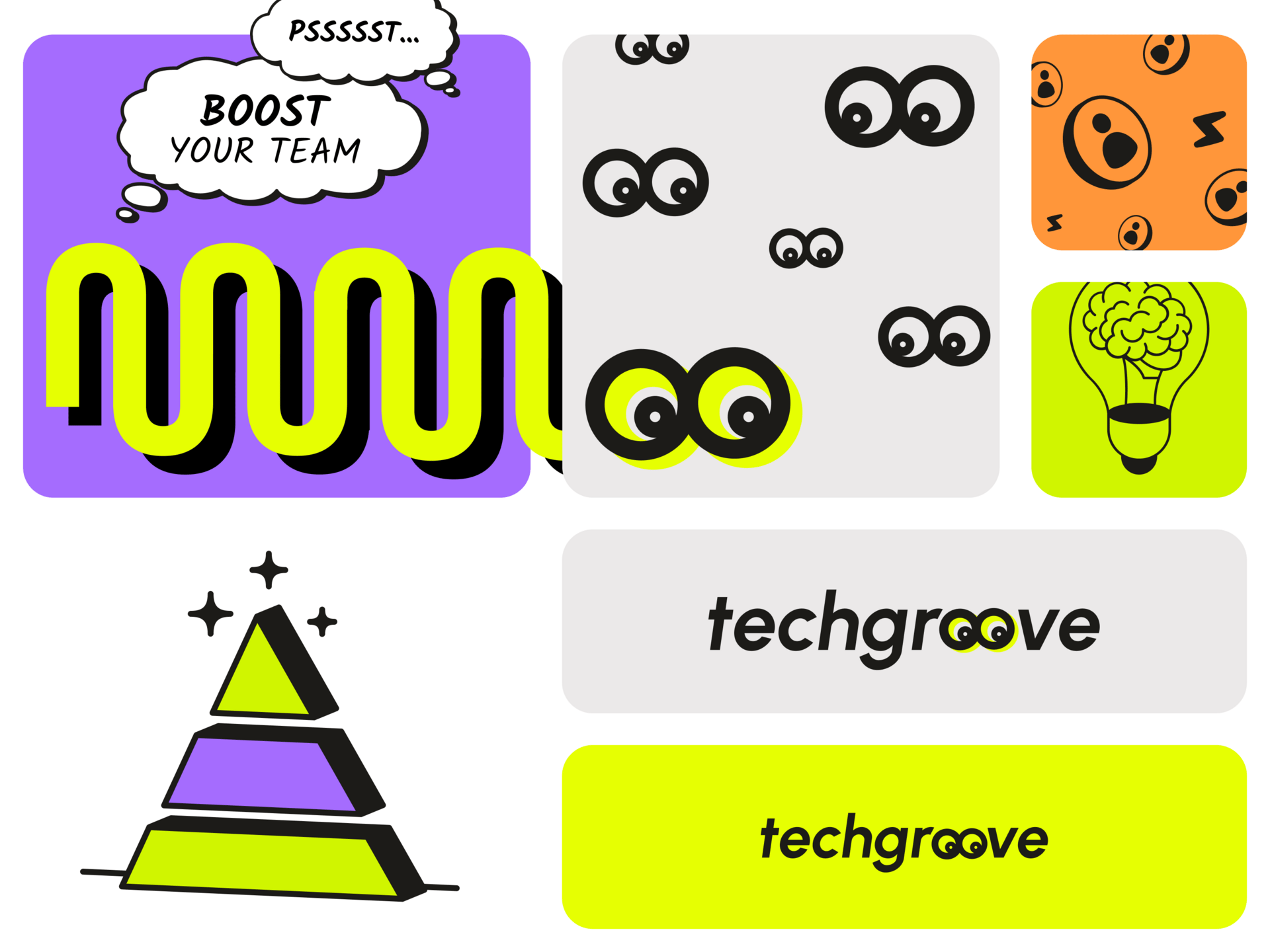
👀 Examples of Neobrutalism Design

Got a Favorite Neobrutalist Font?
Hit reply or drop me a message — I’d love to see what you’re using.
If there’s enough interest, I’ll update the web version with even more free and paid fonts.


