In my last post, I covered the 10 Principles of Good Newsletter Design.
This time we will dive into the practical part of designing a newsletter and my personal design process that I apply for any project.
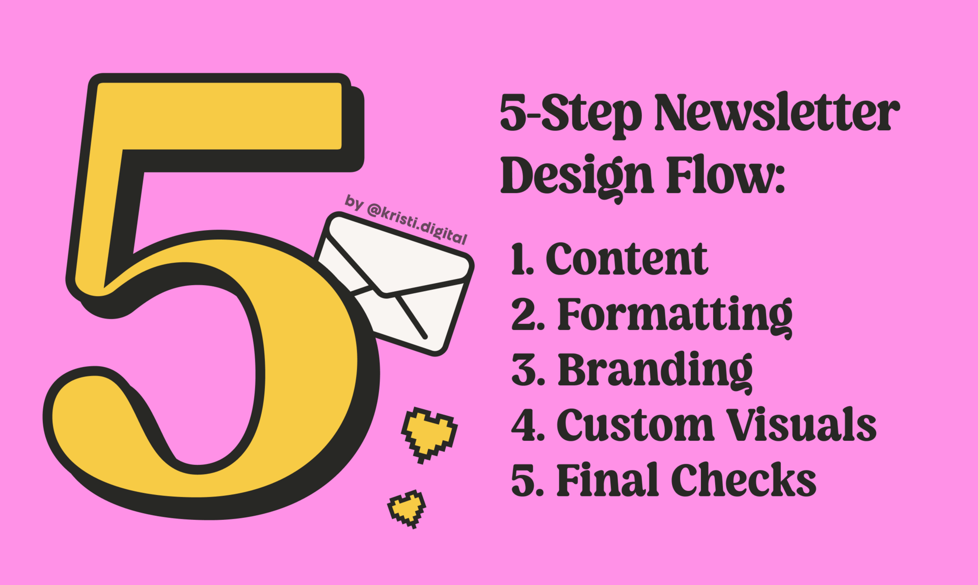
After designing dozens of newsletters for clients and growing my own, I developed a simple, repeatable process that helps me move from messy draft to polished design:

1. Good Design Begins with Good Content
As a designer and a visual person, I’ll admit — I don’t love writing. 😅 So sometimes, even in my own newsletters, I jump straight into styling things. I start building beautiful layouts, creating visuals in Figma and adjusting colors… and somewhere along the way, my original idea gets lost.
The visual fluff overpowers the message. And by the time I’m done, I’ve forgotten what I wanted to say in the first place.
That’s why this is my very first tip:
What to Do: Write your content in the beehiiv editor first. Don’t worry about even basic styling (like headings or bold — unless it helps you with structure) yet. Just focus on making your message clear, valuable, and present.
Why It Works: Without solid content, no amount of styling or formatting will help. This step ensures your ideas are clear and valuable on their own — even without visuals. It’s your foundation — build it strong.
Example: I often begin by typing messy bullet points in the editor — just to make sure the whole story is there. Then I flesh out each point before moving on to formatting.
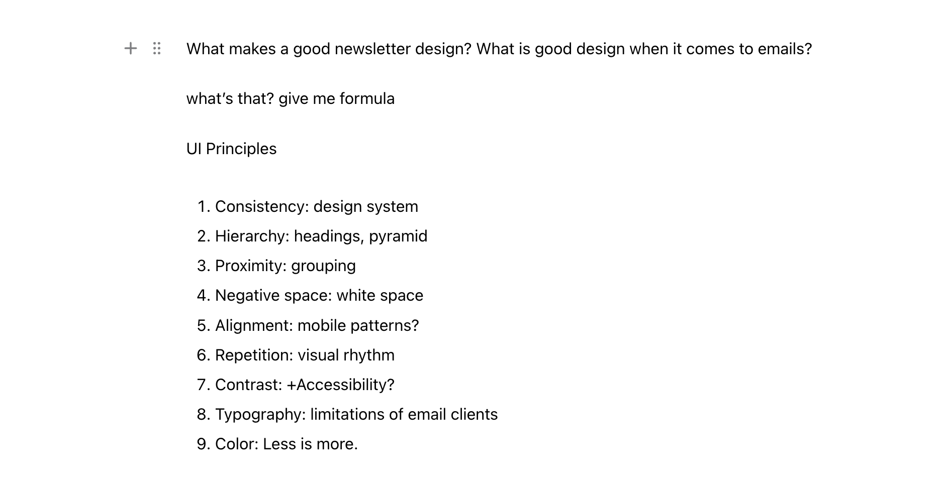
Example: Writing my newsletter in beehiiv editor
Principles Applied (in their most basic form): Hierarchy, Negative Space, Alignment

2. Good Content Deserves Good Formatting
Once your draft is written, you can make it easier to read with proper use of headings, spacings, and basic styling.
What to Do: Go through your content and add semantic formatting — not decoration.
Headings (H1, H2, H3…) to create hierarchy
Spacing to separate ideas into blocks
Basic styles: bold, italic, highlights to add emphasis
Buttons, links, quotes, lists, images, content breaks, and embeds to guide readers and enhance skimmability.
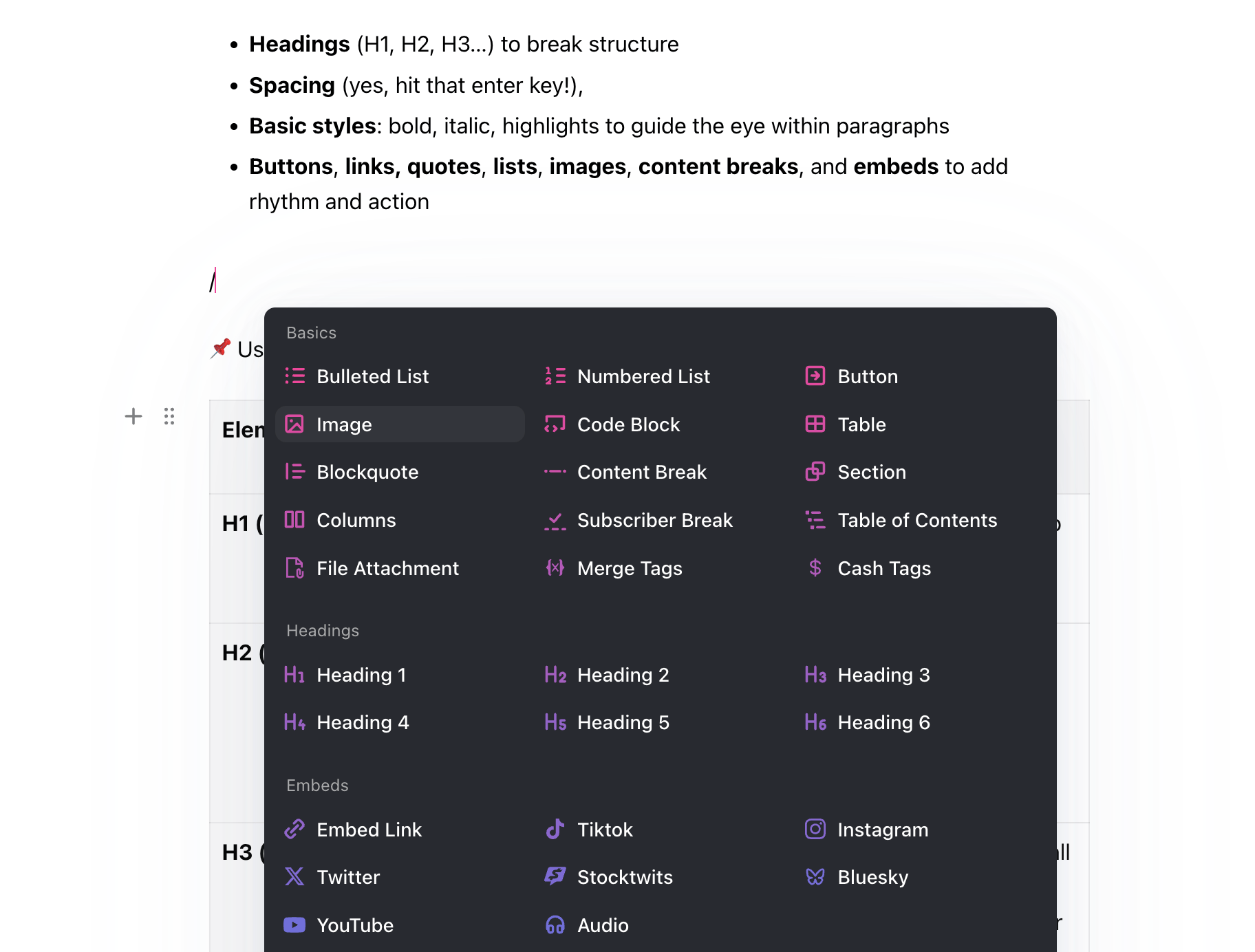
Example: The beehiiv editor gives you plenty of formatting tools
Here’s a cheat sheet with best practices for each element inside your newsletter.
Element | Recommended Size | Design Tip / Best Practice |
|---|---|---|
H1 | 36-48 px | Use once per email. Keep it short, bold, and attention-grabbing. |
H2 | 32–40 px | Use for main sections. Think of them like chapters. Help readers navigate and scan your structure. |
H3 | 28–32 px | Use for subsections, small context titles or longer lists. Keep hierarchy clear — don’t jump from H2 to H4 randomly. |
H4 | 24–28 px | Use inside custom sections like callouts, content blocks, or widget labels. Small but still readable. |
H5 | 20–24 px | Use for numbered steps, mini tutorials, or FAQ-style layout. Helps create a logical reading flow. |
H6 | 14 (ALL CAPS), 16-20 px | Use for tiny notes, section captions, or small yet important text. Always ensure good contrast for legibility. |
Paragraphs | 16–20 px | Keep them short (2–4 lines). Use generous line height and spacing for better readability. |
Bold | — | Emphasize key ideas. Use sparingly to highlight keywords or sentences you want people to stop and read. |
Italic | — | Great for side notes, quotes, or parenthetical thoughts. Adds nuance and rhythm to your copy. |
Highlight | — | Use for emphasis, like callouts, disclaimers, or juicy stats. Don’t overdo it or you’ll lose the effect. |
Text Links | 16–20 px, underlined | Use to provide further depth, sources, or side content. Not every link needs to drive a click — some build trust. |
Embeds | 14–20 px | Rich blocks like tweets, charts, videos, or link previews. They add depth, context, and visual interest — especially when you want to encourage clicks without overwhelming your design. Use them sparingly for maximum impact. |
Buttons | 16–20 px, semibold or bold | They drive action. Use one strong call-to-action (CTA) per section max. Keep it short (2–3 words), actionable, and easy to spot. |
Lists | 16–20 px | Great for steps, tips, rankings. Adds clarity to process-focused content. Use sparingly for best effect. |
Blockquotes | 20–48 px | Use to break rhythm or highlight an idea. Can be a real quote, tip/note or just a powerful thought. |
Images | 1200×630 px (thumbnail), 1600×900 px (landscape), 1000×1000 px (1:1 square) | Your best visual breaks or visual communication. Support your idea with illustrations, charts, or bring emotional impact with GIFs and memes. Don’t overuse, keep on-brand, compressed, and purposeful. |
Content Breaks | 1–4 px line, 16–40px spacing around | A horizontal divider. Helps break long emails into manageable sections. Keeps flow clean and focused. |
📌 PRO TIP: For better typography rhythm, make sure your font sizes increase by steps of 2, 4, or 8px. This is a common technique that instantly makes your layout feel more professional.
🔥 Bonus Tip: Avoid skipping heading levels (e.g. jumping from H2 to H5). It breaks the visual rhythm and confuses hierarchy.
Why It Works: If your text content looks messy, no decorations will fix it. Focus on structure and clarity from the start. Proper formatting (even without visuals) makes your writing readable and reduces cognitive load.
Example: Formatting this post in beehiiv editor using text styles, headings and widgets.
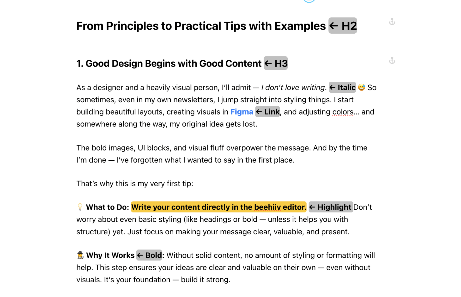
Example: Formatting this newsletter in beehiiv editor
Principles Applied: Hierarchy, Typography, Alignment, Negative Space, Repetition, Contrast

3. Brand & Personality
After formatting, comes the fun part — making it feel like you. This part takes practice and experimentation.
What to Do: Use beehiiv’s advanced style settings or custom sections to apply your visual identity:
📬 Email Header: Add a banner image or logo that reinforces your brand every time in every issue.
Principles: Brand Personality + Brand Recognition🔠 Fonts: Choose font pairings that express your tone — editorial, modern, playful, strong, friendly, casual?
Principles: Typography + Consistency🧩 Widgets: Style links, embeds, quotes, and images to match your brand.
Principles: Balance + Color + Typography📦 Branded callout sections: Reuse visual blocks, patterns or layouts across issues to build familiarity.
Principles: Repetition + Consistency + Brand Personality🔚 Email Footer: Keep it human — add a logo, social links, and maybe a personal sign-off.
Principles: Brand Personality + Brand Recognition
📌 PRO TIP: Email clients support only a limited set of fonts — 100% safe options are Arial, Helvetica, Times New Roman, Verdana, Courier, and Georgia. Some platforms support a few more.
Why It Works: Strong branding builds trust, recognition, and emotional connection. When your newsletter looks and feels consistent over time, readers remember you.
Your banner sets the vibe instantly. Whether animated or static, it’s a subtle reminder of who you are and what you’re about.
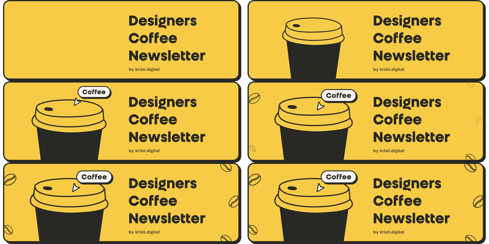
For my own newsletter, I use a playful GIF animation created in Jitter — it brings a bit of movement and personality right to the top of every issue. It’s fun, a little extra, and represents me.
On the flip side, here’s a strong static banner from Straight Shoot Unfiltered — bold, retro, and instantly recognizable. It aligns perfectly with their honest tone and sets the vibe before you even read it:
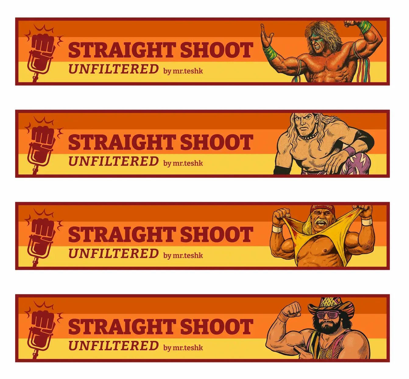
Example: Email banners for Straight Shoot Unfiltered
Example 2: Custom widgets, separators & sections
This is where you can get creative. Even if your brand leans minimalist, the right details go a long way — like color accents, dividers, or callout sections.
Client example – So Many Points:
For this clean and simple newsletter, I added subtle accents and a branded separator to elevate the layout without overpowering it.
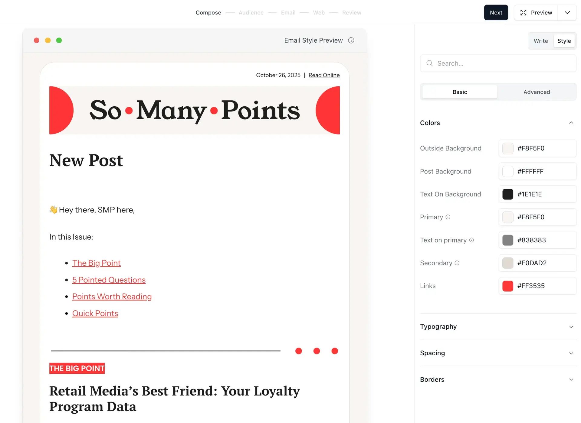
Example: Email colors & custom separator for So Many Points
Client example – Mind Your Business:
A standout CTA section using a visual + button combo that grabs attention and drives action.
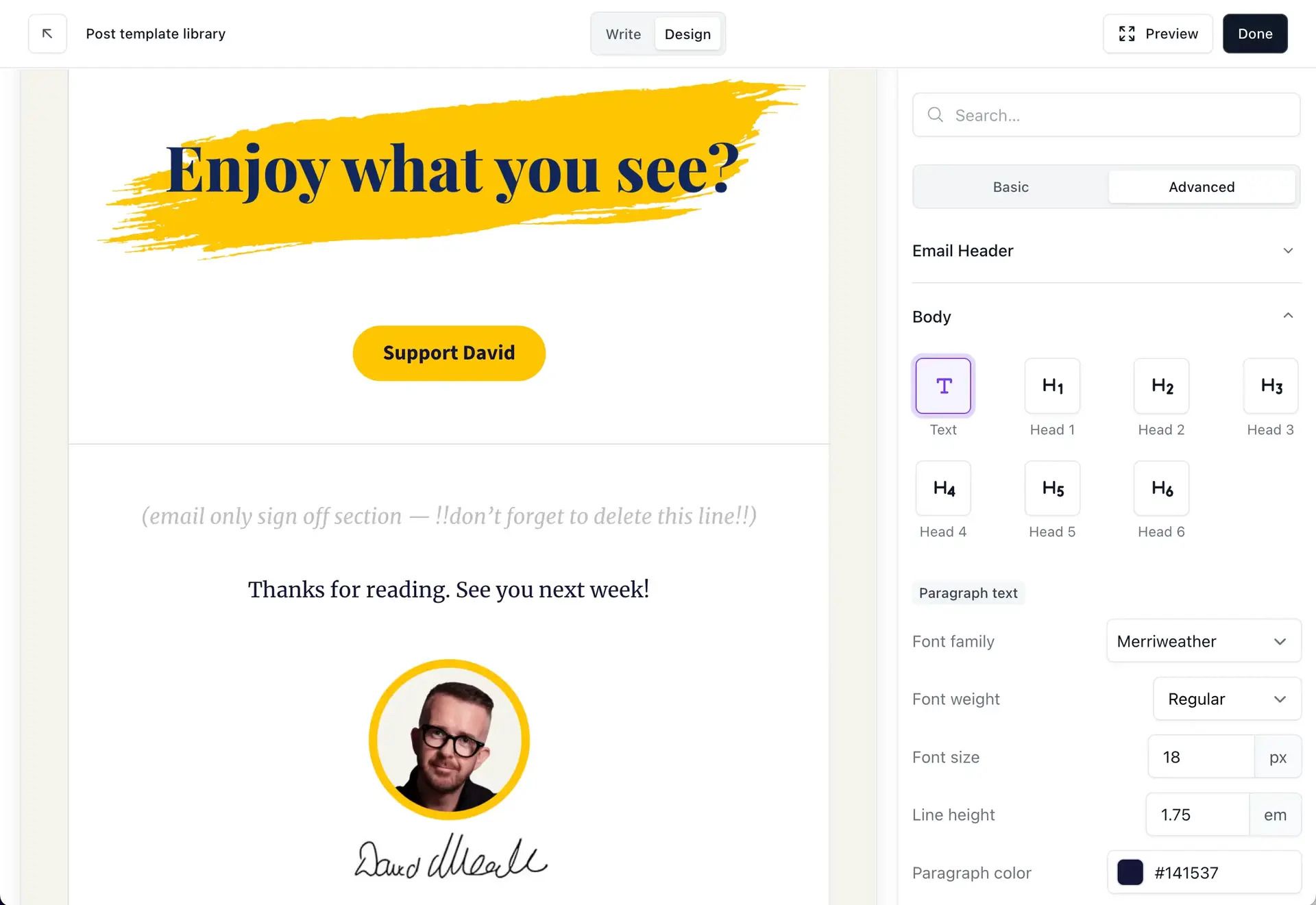
Example: CTA section for Mind Your Business
Principles Applied: All 10 Principles plus Brand Personality & Recognition

4. Add Custom Visuals (Optional, but Powerful)
At this point, your post is already solid. But if you want to go the extra mile — visuals can elevate it from nice to memorable.
Use visuals to support your message — not distract from it.
What to Do:
Create your own visuals in Figma or Canva and export as images
Use screenshots, diagrams, or illustrations
Reuse visual motifs from past posts (icons, stickers, etc.)
My Example:
A single visual element can shift the entire look and feel — adding personality and guiding the reader’s attention.
Client example – TTRPG Insider:
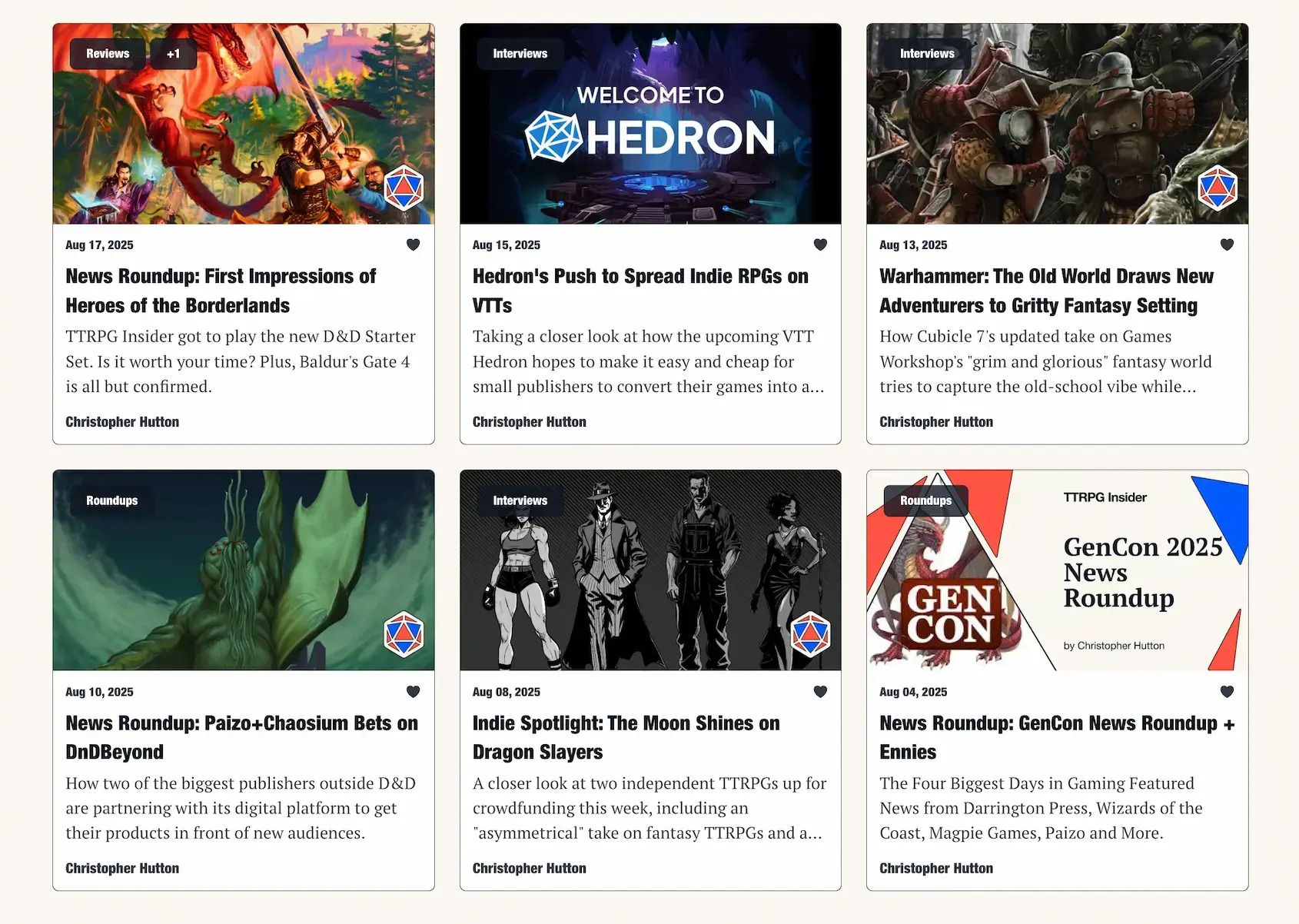
For this client, I designed custom thumbnail and banner templates that match their bold and playful brand identity.
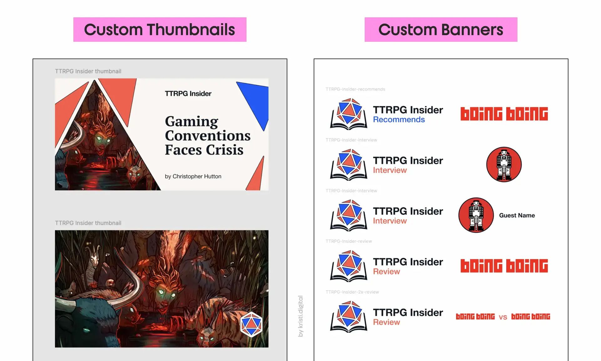
Example: Custom thumbnail & banner templates for TTRPG Insider
These templates not only keep the newsletter feeling cohesive — they also add a subtle layer of brand recognition on social media and inside Beehiiv’s post grid.
Principles Applied: All 10 Principles plus Brand Personality & Recognition

5. Before you hit SEND
You’re almost there — but before you publish or schedule, give your email one final review with this checklist:
Contrast: Is the text readable on all backgrounds and devices? (Dark grey on beige = better than pure black on white.)
Skimmability: Could someone scrolling at 7am with one eye open still get the point from your headings, bolds, and buttons alone?
Dark Mode: Always send yourself a test. Open it on mobile. Check both light and dark mode.
Spacing: Are your sections breathing? Or are they crammed like a Tokyo train at rush hour?
Call to Action: What’s the one thing you want the reader to do next? Add a clear CTA. One per section, max.
My Example:
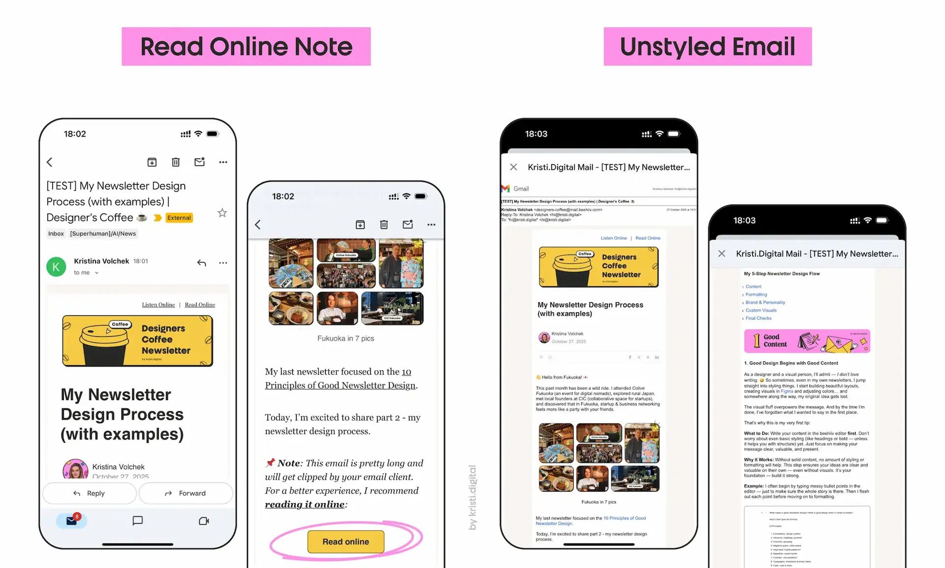
I sent a test email to myself and opened it in Gmail on mobile. Then I switched my phone to Dark Mode to preview how it looks.
As you can see, my email got clipped by Gmail. This happens when visual-heavy emails go over the 102 KB size limit. If your most important CTA or link is near the end of your post, that could be a problem — users have to click “View entire message” and get shown a browser version without any styling.
So what can you do?
Well, it depends on your priorities. In my case, I couldn’t make the email shorter or remove screenshots — so I added a note right at the beginning to encourage people to read it online.
📌 PRO TIP: Always preview your post on mobile. 70%+ of readers are likely viewing from their phones.
Closing Thoughts
You don’t need to be a designer to design well. You just need to care about the reader experience.
Write clearly. Format correctly. Then layer on style and personality. That’s the whole process. And it works.
Stay clear. Stay creative. And keep building beautiful newsletters.
Thinking of launching your own newsletter?
Try beehiiv with my partner link to get a free 30-day trial + 20% off for 3 months. If you end up loving it and upgrading, I’ll earn a small commission — and you’ll save money. Win-win!
Are you a designer or creator working on your own newsletter?
I’d love to see what you’re building.
Reply to this email (or drop a comment under the post) with a link to your newsletter — or even a sneak peek of your draft.
I might feature a few cool ones in a future edition. 😉

