In Newsletters — Text Is Design
I work with a lot of creators, and I’ve seen this mistake again and again:
You put so much effort into your writing… but forget the design.
And without clear structure, thoughtful typography, or proper spacing — even the best ideas can feel unreadable.
Good news: You don’t need to be a designer to make your newsletter beautiful. You just need to understand a few simple design principles that make your content easier to read — and more enjoyable to scroll.
What Makes a Good Newsletter Design?
Design isn’t about decorating your post — it’s about helping your reader follow along.
If your reader has to make an effort just to read your content, they’ll scroll past.
But what does good design actually mean?
Let’s attach some names and patterns to this vague concept. These are principles that every professional designer knows and uses.
10 Principles of Good Newsletter Design:
1. Balance
Balance in design means distributing visual weight so no section overpowers the others.
Here are most common types of visual balance:
Symmetrical: mirrored elements, very stable (e.g. post grid, columns)
Asymmetrical: different shapes but still visually balanced (e.g. hero sections)
Radial: elements radiate from a central focal point (rare in newsletters, but fun!)
Mosaic: organized chaos — like Pinterest’s masonry grid.


Example: Symmetrical is often used for post grids or columns

Example: Asymmetrical is often used for hero sections or ecommerce product pages
Don’t forget about the “vertical balance” too — the flow of your entire email. Balance the weight of your intro and outro, headers, text, and visuals so that your email is easy to read and guides people to your CTA.
2. Consistency
Inconsistent formatting = sloppy experience. Use the same heading styles, color scheme, font sizes, spacing rules and visual aesthetics throughout.
It builds trust and feels professional.
Designers use something called a design system — a reusable library of components, colors and styles. But you can start small: Create a mini style guide for yourself. It can be as simple as a Notion doc or Canva.

Example: I like to prepare a mini style guide for my clients — like this one for So Many Points
3. Visual Hierarchy
Hierarchy = your content’s roadmap. It tells readers what to look at first, second, and next. It can be created by using size (bigger = more important), spacing, color, and contrast.
Structure your content like a pyramid: big idea first (H1), followed by clear sections (H2), and detailed content below (H3 + paragraphs).
👀 People scan before they read. So let them.

Which one’s easier to read: the left layout with visual hierarchy, or just a wall of text on the right?
4. Proximity & Spacing
Spacing isn’t just aesthetic — it communicates relationships. Group related content together — the closer elements are, the more connected they feel to readers.
Why it works? According to Gestalt psychology, the law of proximity suggests that we perceive elements that are close to each other as a single group.
So don’t separate your H2 from its paragraph, or your CTA button from its context.
However, sometimes you do need to use extra spacing intentionally. Negative space (or simply, white space) is not wasted space. It gives the reader a break, encouraging them to pause and process your point. If everything is packed together, nothing stands out.

You can instantly spot how the dots are grouped — and how those groups are visually organized.

Example: Alpha Template — Hero section grouping
5. Alignment
Mixing left and center alignment without purpose feels messy and unprofessional.
Default to left-align — it’s easier to scan, especially on mobile (which is where most readers are).
Stat: 96.2% of global users browse the internet on mobile. (Statista)


Example: The Putty Template uses center alignment for the hero section to create visual impact, while the post layout switches to left alignment for better readability and scannability.
6. Repetition (Pattern)
Repeating elements creates visual rhythm. It gives your newsletter a recognizable structure and predictable flow. Use repetition for buttons, quote blocks, custom sections with subheadings, callout sections, or lists.

Without repetition, everything looks random and messy

Example: To help Freelance Opportunities organize their long job lists, I used beehiiv’s table widget to create a clear, repetitive layout. Each cell follows the same pattern (job link + short details) making the list easy to scan and quick to navigate.
7. Contrast
Contrast drives attention. You can use higher (even jarring) contrast when you want to capture a readers attention. For example, you can visually signal which action here is more important.

But contrast isn’t just for buttons. Make sure there’s enough difference between text and background across your whole layout — headlines, highlights, buttons, and even images with text overlays.
Use bold, italic, and highlights like you’d use spices in a dish — just enough to add flavor, not to overwhelm. I want a little spicy dish, not to burn myself. 🌶️
📌 When using colorful backgrounds (e.g., buttons, image overlays, full-width sections), make sure your text still passes WCAG contrast ratio guidelines. I’ll share simple tools to check this in the next tip on accessibility.
8. Accessibility
Accessibility helps everyone read your content — including those with vision impairment or other disabilities.
The good news is Beehiiv already takes care of most of the heavy lifting — things like semantic HTML, mobile responsiveness, and metadata are built in. So you don’t need to worry about technical compliance. But you still control the stuff that lives inside your post:
Color contrast — pass WCAG AA/AAA standards
Proper headings — use H2, H3, etc.
Descriptive links — e.g. “Get the Checklist” not “Click here”
Alt text & captions for images — or mark images decorative if they are visual only (See Alt text examples)
⚒️ Easy Accessibility Checks:
1. Check your contrast ratio
Use colourcontrast.cc (comes as Chrome extension too) to test contrast between background and text colors. Just enter your hex codes and check if your pairing passes AA or AAA Normal for body, links, buttons and AA or AAA Large for headlines.

Example: Checking contrast ratio for paragraph text against highlight color in this template
2. See like a colorblind reader
Use the Colorblindly Chrome extension to simulate how your newsletter looks under different types of color vision.
Below is a quick screen recording of how the tool looks in practice ↓
9. Typography
Good typography = good experience. There are many things, but key rules are:
Don’t use more than two fonts — you don’t want to look childish or messy.
Avoid overdecorated, expressive (handwritten, script) and monospaced fonts.
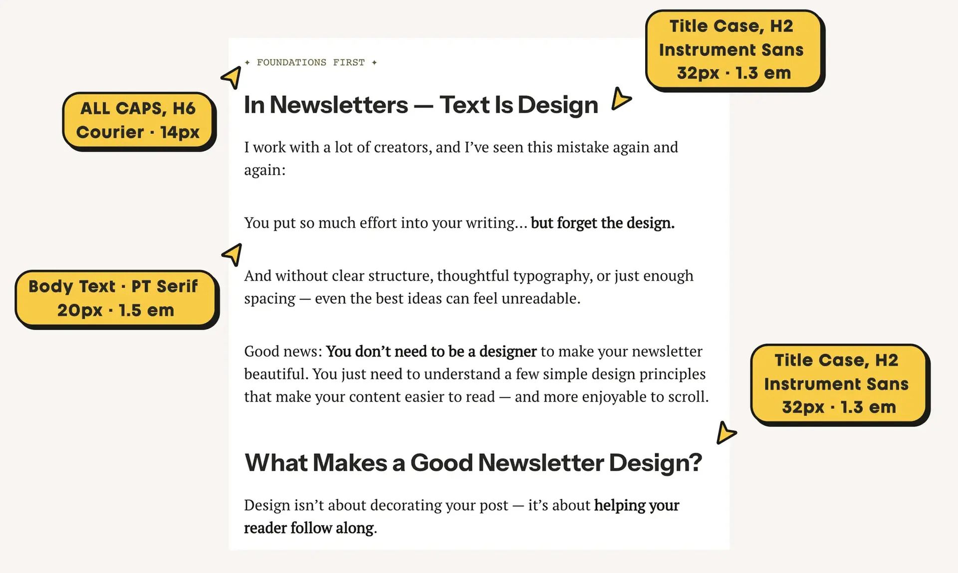
For body text, select a clean readable font and make it at least 16px.
Keep line height loose enough for breathing room (for example, 110-130% for headings and 130-160% for paragraphs).
No punctuation marks (and no “!” please) in buttons 🙃
ALL CAPS is okay, especially when you are not overusing it. Great for smaller typography (e.g. smaller than 16px) and with larger letter spacing (1-2px).

Example: This newsletter template’s font styles
📌 PRO TIP: Email clients support only a limited set of fonts — 100% safe options are Arial, Helvetica, Times New Roman, Verdana, Courier, and Georgia. Some platforms support a few more.
10. Color
Less is more. If you’re unsure how to pair colors for both contrast and aesthetic — stick with black-and-white. If you feel more confident, use 1–2 accent colors max. Color should guide attention, not distract from your message.
The 60–30–10 rule
One of the simplest and most effective ways to create color harmony — even if you’re not a designer. It’s a classic interior design principle that works beautifully in newsletters too.
Here’s what it means:
60% – Primary Color (Background)
Sets the overall tone and covers large areas, like backgrounds or primary components. Keep it neutral — white, off-white, soft gray, or beige.30% – Secondary Color
Adds contrast and personality without overwhelming the dominant color. Think headings, buttons, dividers, accent backgrounds.10% – Accent / Pop Color
This is your attention-grabbing color. It could be a contrasting CTA button, badge, label, icon, or even an emoji. It should stand out and spark interest — like chili flakes on a pasta.

Example: This newsletter body follows the 60-30-10 rule
Closing Thoughts
And that’s a wrap on the 10 design principles that can instantly upgrade your newsletter — even if you don’t consider yourself a designer.
Whether you’re writing essays, curating links, or sharing personal stories, your newsletter is more than just content. It’s an experience. And with a few simple design moves — headings that guide, spacing that breathes, buttons that click — you make that experience more enjoyable, more readable, and more you.
These principles are just the foundation.
Next time, I’ll show you how I put them to work — with real tips, layout examples, and simple formatting tricks (all inside beehiiv editor).
Because writing is design.
And your readers can feel the difference.
I just published Part 2 of my newsletter design series 👇
Thinking of launching your own newsletter?
Try beehiiv with my partner link to get a free 30-day trial + 20% off for 3 months. If you end up loving it and upgrading, I’ll earn a small commission — and you’ll save money. Win-win!
Are you a designer or creator working on your own newsletter?
I’d love to see what you’re building.
Reply to this email (or drop a comment under the post) with a link to your newsletter — or even a sneak peek of your draft.
I might feature a few cool ones in a future edition. 😉


